
-
 Zune Seo
- 30 Apr, 2024
AWS 비용 최적화 Part 1: 버즈빌은 어떻게 월 1억 이상의 AWS 비용을 절약할 수 있었을까
버즈빌은 2023년 한 해 동안 월간 약 1.2억, 연 기준으로 14억에 달하는 AWS 비용을 절약하였습니다. 그 경험과 팁을 여러 차례에 걸쳐 공유합니다. AWS 비용 최적화 Part 1: 버즈빌은 어떻게 월 1억 이상의 AWS 비용을 절약할 수 있었을까 (준비중) …
Read Article Maxence Mauduit
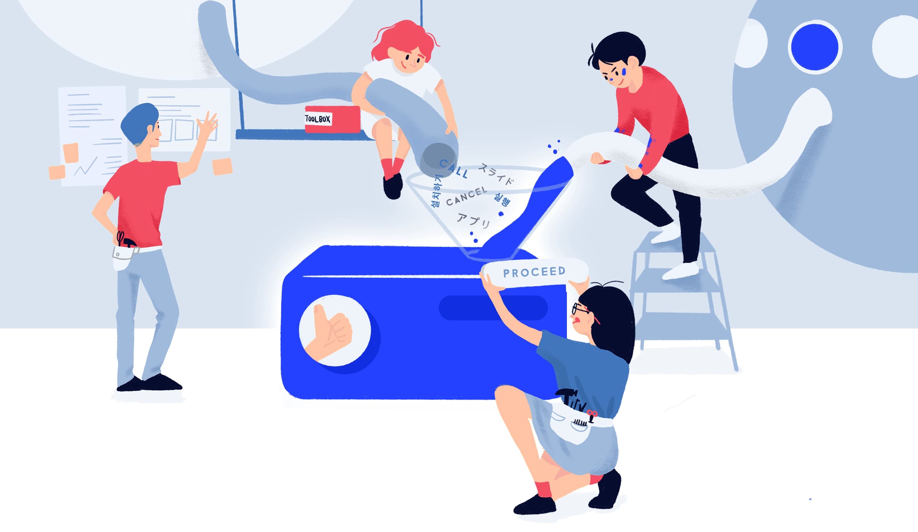
Design system vs startup. Takeaways.
We built a Design system. It took us time, resources and a lot of energy, involving pretty much everyone in our design team. And it’s just the beginning of a long story. If you are working at a startup and are considering building a design system, you might find clues reading about our experience.
First off, we can’t ignore how time consuming building a system can be.
Naturally some of the worries we had were to know if a design system was really worth it. And can a startup get any advantage from it?
Back when we decided to start building our system we were a 5–6 years old startup counting about 50+ members, including 3 product and 2 visual designers. The business was at that time aggressively expanding, our Business Development team got a few big partners that brought us to an all new level and our product team needed to react fast, scaling up our headcount, hiring lots of engineers to support our growing needs. In terms of design, we had 2 options, either hire a lot of designers to support in a linear way each integration or keep a core and highly efficient team to build up a system that could cover up all our needs in a centralized way. We went with option 2.
To understand what’s at stake, let’s have a closer look at the problems we are trying to solve.
We, at Buzzvil, are building a scalable platform for multiple partners in Korea, Japan and the US. We are young but we also build complex products that have to be permanently maintained and constantly developed. In that sense, even if you are startup, you should not be afraid of building a design system that will help you meet your needs.
I will intentionally avoid giving details about our products as I hope this article to be generic enough, focusing more on the thinking, less on the making.

Two in-house apps, 15+ white labeled app and a bunch of SDK and API to manage (not counting all the necessary marketing work that comes on top of it, or even mentioning the dashboard to manage and operate all that.)
It sounds like a pretty big product line already, especially for a startup with only a handful of designers.
Well, systems are all about connecting things together, allowing these “things” to be reused at different places. And that’s what we’ve been doing, (re)factoring our design assets into reusable components. Easy peasy, at least in theory.
Technical debt also applies to design. We don’t spend time doing things twice, saving up time to think more.
This was our starting point. A major problem that we want to solve throughout the construction of a system. We started working on this about a year ago and on the way, different issues were solved.
We are a small company that dreams big. Big enough to have clients all over the world. Being a global company is awesome, but it makes you realize that your design needs to fit people, markets with different cultural backgrounds and various levels of appreciation and understanding toward technology and aesthetics.

Fortunately, we aren’t the only ones in this situation. Designers who once tackled the same problem like ours created standards, style guides and more recently the notion of Design System became pretty popular and many wrote their thoughts or shared their Design System online.
Complex problems usually require simple solutions.
Ironically, if you have experience designing products, you will probably agree saying that making things simple.. is pretty complex. 🔁
When designing an application, we carry a visual semantic. It is a form of language that is expected to be understood by people using our service.
By reducing the complexity of that language we expect it to be understood by more people. Minimalism in design comes from this mindset. Simplicity is key. By keeping things simple, more people will understand what you want to express.
But what does simplicity has to do with a systematic approach?
Principles. Working with a systemic approach means setting principles and procedures in order to organize our workflow around some common grounds and values.
In our case and to answer our business requirements, minimalism is one of our key principles to fit the diverse markets we are in and to be manageable to a small design team.
Our team started from Google Material Design and built our own components and principles from there so we wouldn’t have to start from scratch.
There were a few solid reasons why we started building our own system this way.
First of all, Material is an incredible design language that constantly evolves. And second, Material is already widely spread, reused, and used by millions of users throughout Android OS and major apps that follow Material Design guidelines.
Buzzvil internally manages Slidejoy (US, Global) and HoneyScreen (Korea, Japan & Taiwan) as our two in-house (B2C) clients. But we also develop, support and manage partner’s mobile applications through our SDK. Each of them have very particular needs when it comes to express their brand identity. How can our system provide enough flexibility to accommodate such ecosystem?
To this dilemma, we needed an answer that supports third party brand integration in order to fit each of our partners’ needs.
A lot of theories and practical examples are out there as systems are spreading across IT companies, but I found Daniel Eden’s approach most suitable for our needs.
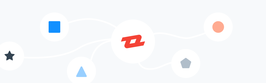
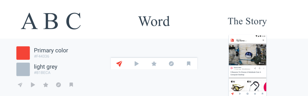
Eden has an interesting way of organizing and structuring a design system. Everything starts by separating your design assets into 2 layers, pattern and expression.
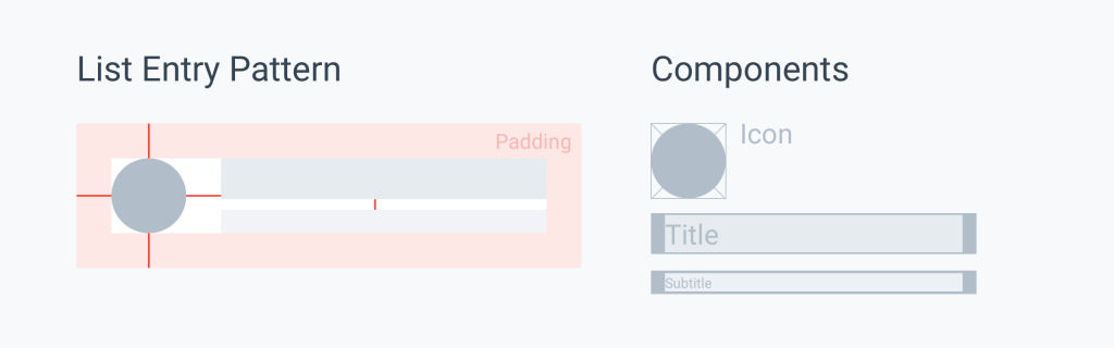
Patterns are our layout’s blocks. They give exact specifications on how our components should be executed. Patterns are carrying components made of sub-components and so on. They are expressionless They don’t carry any message whatsoever. Components are reusable within a service and even across our entire scope.
A great system factorizes components to an optimal amount, getting rid of replicated ones across our entire design scope. The goal here is to make our life simpler.
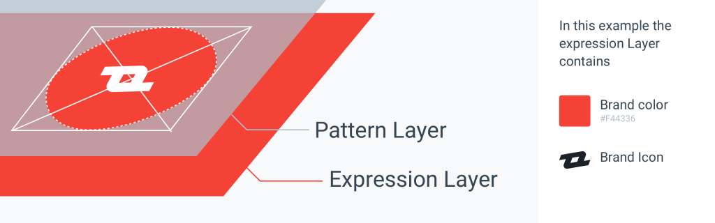
The expression layer carries a message and is the root level of our components. In other words, they aren’t composed by any other sub-components.
We generally refer to them as Atoms (see atomic design from Brad Frost for more infos).
This is where our branding, our tone of voice is contained. Expression layers are colors, text strings, icons and illustrations, photos and videos. They express a message and are ruled by a specific brand guideline, independent from our UI structure.
Now you probably start to understand how scalable this approach is. By identifying everything and thanks to awesome tools such as Figma or Sketch, it is now possible to connect pattern and expression layers with ease.
System’s weakness is on how flexible they are. Balancing between a too rigid or too soft structure isn’t an easy thing. Cutting it into these two chunks made things much easier for us. Blocks just like expression aren’t always from designer’s responsibility as blocks will most likely be integrated by developers and expressions are gonna be handled by marketers to set the brand’s tone of voice. These two chunks will need different types of communication as you won’t translate the same message to a developer or a marketer.
Patterns need to follow devs guidelines while expressions need to be flexible enough for a brand to be loud and clear or a content to be properly displayed. And in the middle of all this, our work is to connect the dots to make sure that in the end, everything is cognitively affordable to people.
In Daniel Eden’s article mentioned earlier, another layer called concept is mentioned. This is how we communicate things to our different stakeholders and where our design is evaluated.
Concepts tell a story. A concept is about communicating an abstract idea by any possible mean. This is where designers must make a difference and the reason why we have been working on a system: to save up resources in order to be able to spend the necessary time on visualizing/materialize ideas over concepts.
To rephrase Eden’s words,
Building an alphabet and a dictionary are foundations to work on what matters the most: the story we are gonna tell to people.
The quality of our foundations affects the clarity of our message while the quality of our story affects the overall experience of our products.
But then, how can we tell if a design is good?
Concepts are made of assumptions that are based on theoretical and practical research. Empathy cannot be easily controlled in advance and testing things out is definitely a great way to judge either your design answers its purpose or not. And to objectively judge something, metrics are key.
In our system, each concept carries a set of metrics that will tell us after testing if our assumptions were right. Just like the entire system, metrics aren’t written in stone. Things are flexible, and can always be adjusted after the first tests. If the results aren’t as expected after a few loops, it means that our concept wasn’t right and needs to be fixed. We assume that our core components are pretty robust and won’t be the main cause of a poor test result, but their assemblage on the other hand, might be in cause.
Another way to say it: your words are all orthographically correct but your sentence isn’t properly constructed and what you need to do is to switch words around to make the grammar right. If that doesn’t work either, it probably means that your entire concept needs to be thought over as the message isn’t answering people’s expectations.
Having a design system is a great way to deliver a design. Yet, we can’t expect everyone around us to think and work like designers. But what we can definitely do is informing them and allowing everyone access our resources to build up rough concepts from pre-made blocks. We have been doing that over the last 6 months, letting people know how this works via some design classes within our company and giving access to everything to everyone. And recently we saw mockups and intentions coming from some of our PM’s or Marketers giving us a huge satisfaction after going through all this.
Great ideas come from every mind, designers have the necessary tools to easily express these ideas, whereas our co-workers might not.
Sharing our assets is a way to help not just our co-workers but anyone communicate on an idea.
Sharing our early concepts, principles and design culture is for everyone to understand our process and to understand how sharing ideas is never a useless thing. In the end, a single concept could resonate in a different way to someone else, bringing up new leads.
Like many others, we will soon share our design system to everyone after cleaning up the mess a bit :). Thanks for taking the time to read me until the end, I’ve decided to keep this article away from our actual products and components to keep it more generic, but I would be happy to answer any question you’d have!
Featured illustration by Jetty Cho.
Zune Seo
버즈빌은 2023년 한 해 동안 월간 약 1.2억, 연 기준으로 14억에 달하는 AWS 비용을 절약하였습니다. 그 경험과 팁을 여러 차례에 걸쳐 공유합니다. AWS 비용 최적화 Part 1: 버즈빌은 어떻게 월 1억 이상의 AWS 비용을 절약할 수 있었을까 (준비중) …
Read Article
 Abel Yoon
들어가며 안녕하세요, 버즈빌 데이터 엔지니어 Abel 입니다. 이번 포스팅에서는 데이터 파이프라인 CI 테스트에 소요되는 시간을 어떻게 7분대에서 3분대로 개선하였는지에 대해 소개하려 합니다. 배경 이전에 버즈빌의 데이터 플랫폼 팀에서 ‘셀프 서빙 데이터 …
Read Article